ASPCA
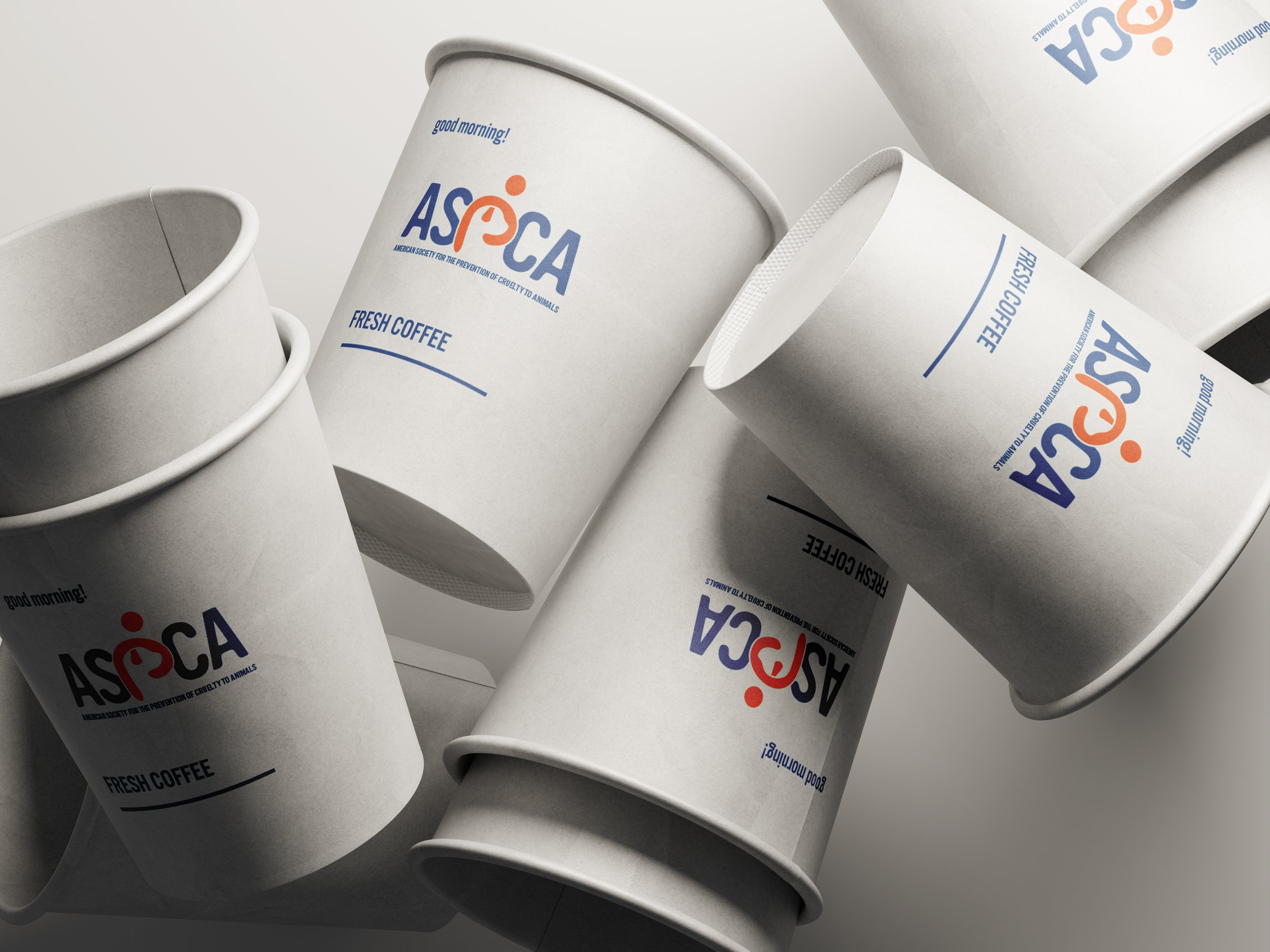
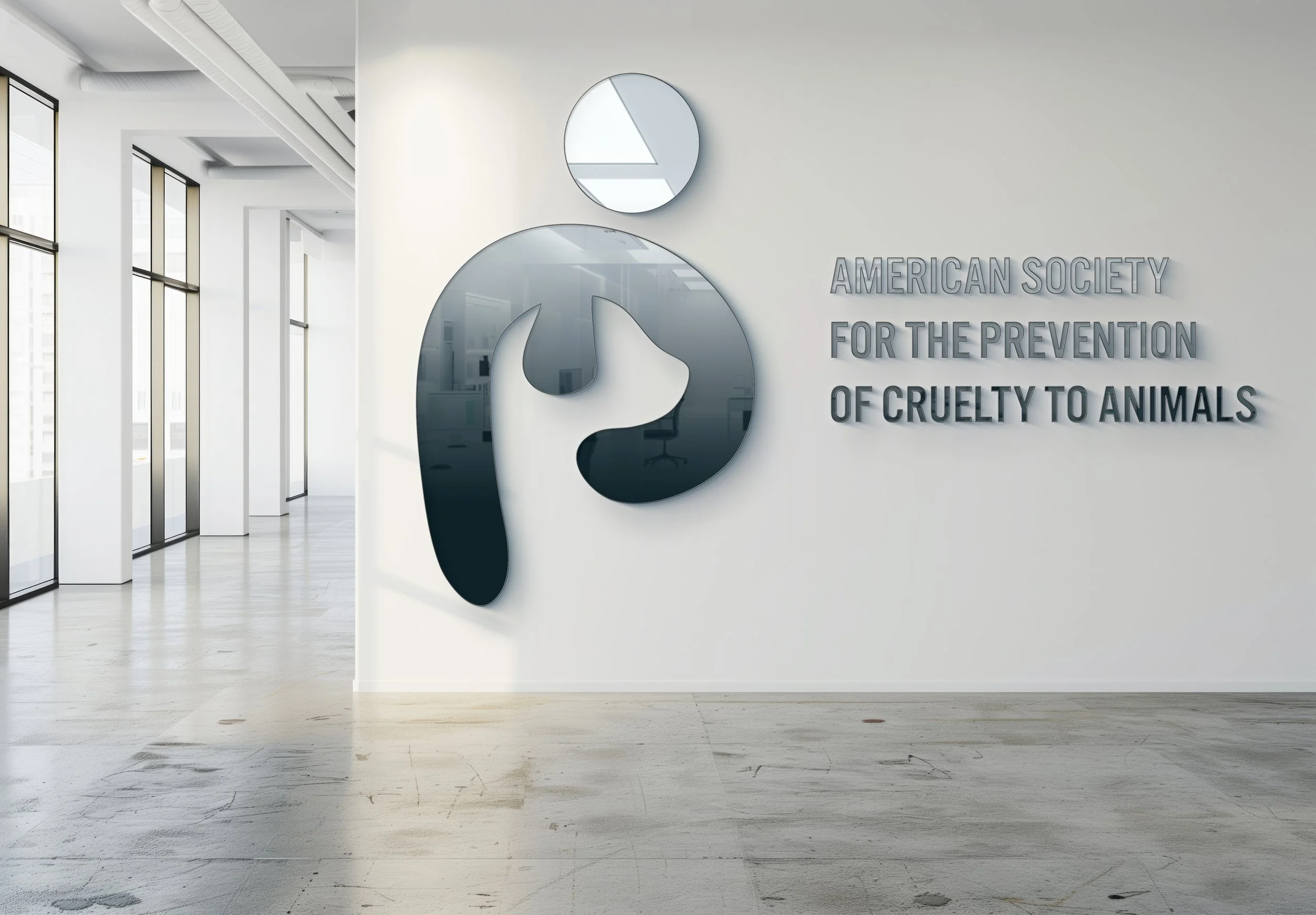
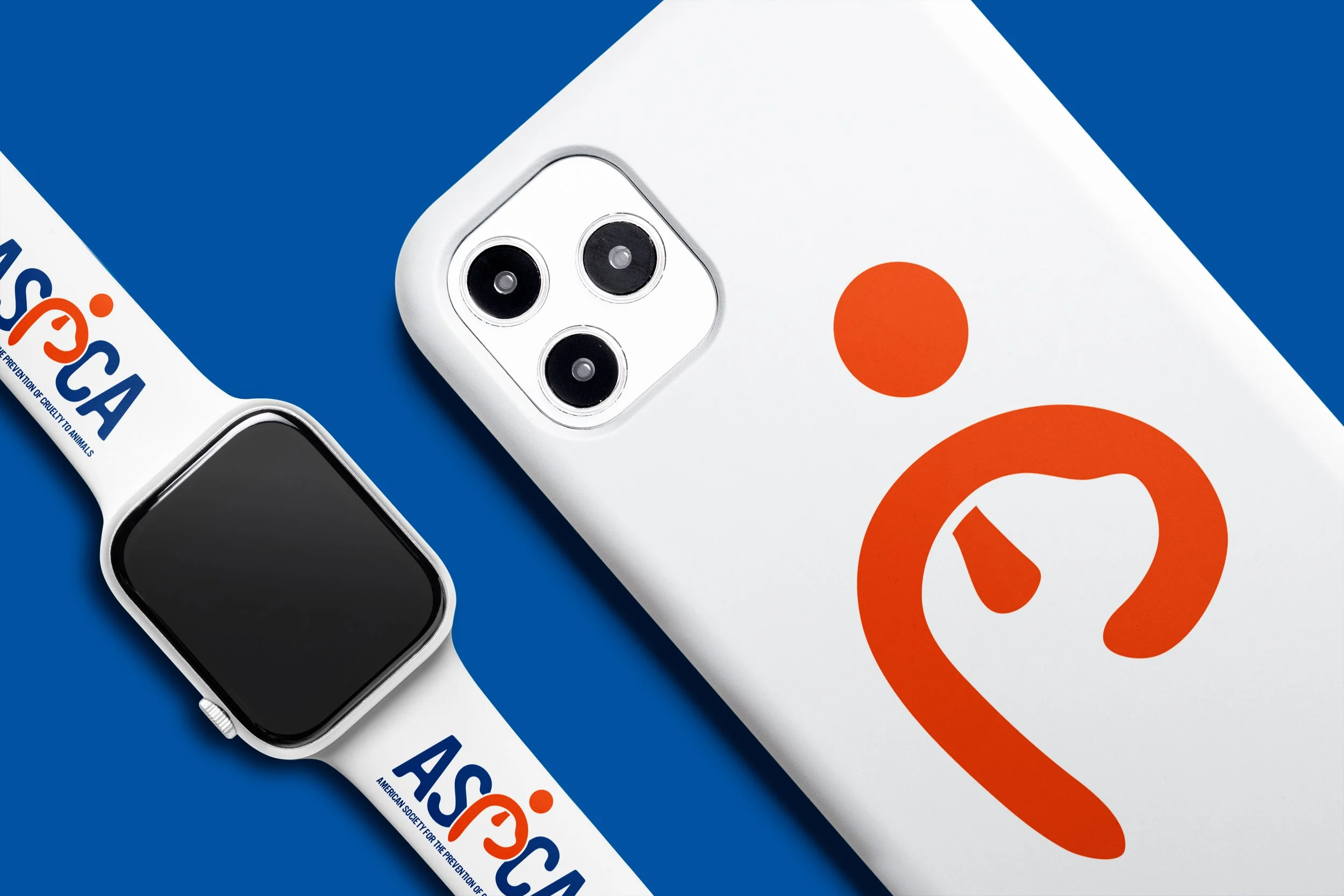
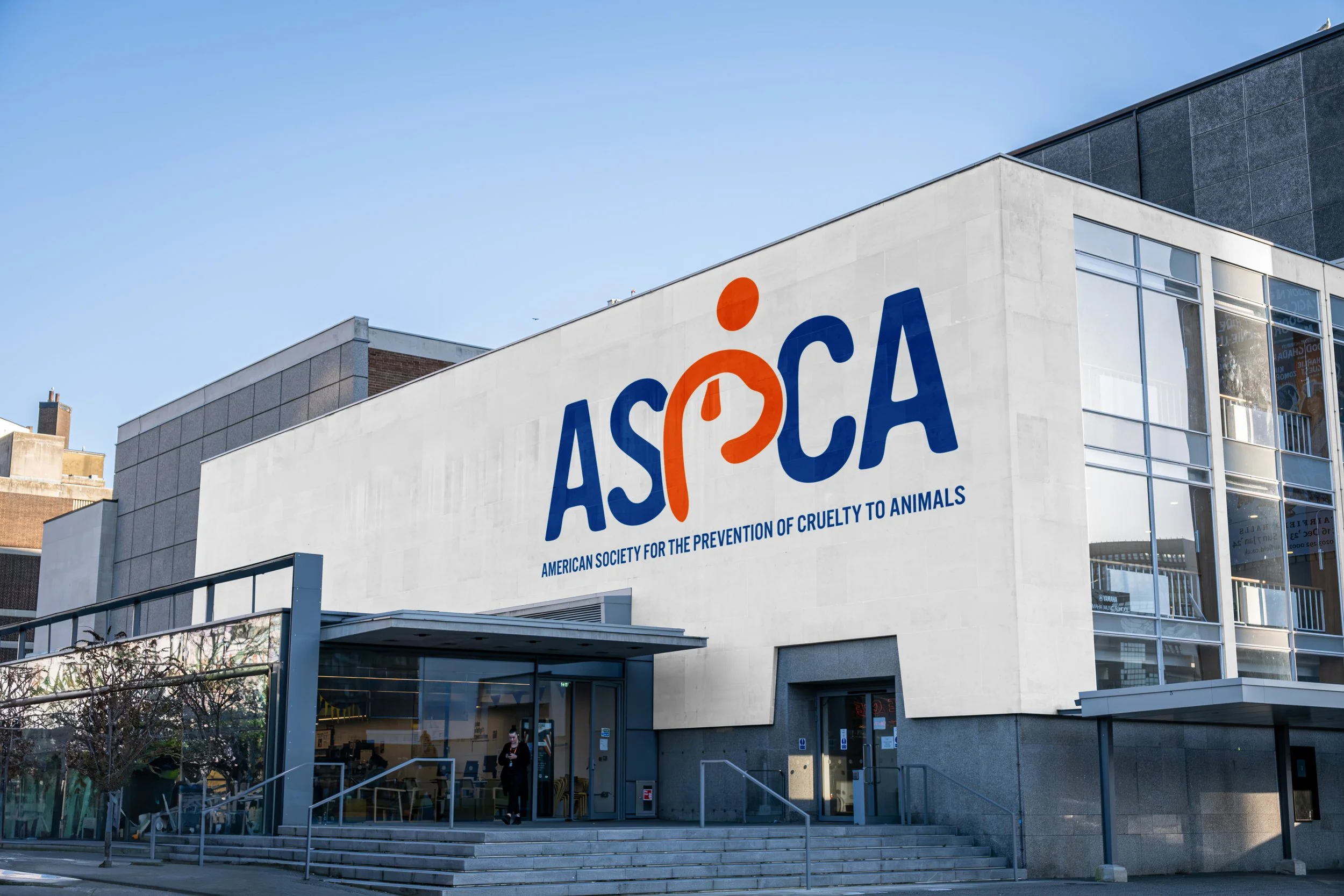
One of my engaging class projects at Iowa State University involved rebranding the ASPCA (American Society for the Prevention of Cruelty to Animals), selected from a prompt to choose a nonprofit or charity of personal interest for a comprehensive identity overhaul. Driven by my passion for animal welfare, rooted in experiences like volunteering at local shelters in the Quad Cities, I aimed to modernize the organization's image while honoring its 150+ year legacy of advocacy against cruelty. One standout highlight is the innovative treatment of the "P" in ASPCA, stylized to resemble arms gently hugging a dog's head, symbolizing protection, empathy, and the organization's nurturing role in animal rescue. The rebrand also features a refreshed logo with interlocking animal silhouettes for unity, a compassionate color palette of soft blues and greens evoking trust and hope, and versatile typography that adapts from bold awareness campaigns to subtle educational materials, ultimately amplifying the ASPCA's mission to inspire broader public engagement and donations through emotionally resonant visuals.